Premium WordPress Themes, Templates & Plugins › Support › WordPress Theme Support › LastPoint › Transparant main header
- This topic has 6 replies, 2 voices, and was last updated 8 years ago by
ThemeofWP.
- AuthorPosts
-
- April 13, 2016 at 8:35 am #8432
Karim Bizih
ParticipantHello again,
Is it possible to make main header semi transparent, so you see the banner behind it, up until the top header?
Same as this website: http://www.valentinobarbers.nl/
- April 13, 2016 at 10:46 am #8433
ThemeofWP
KeymasterHi Karim, yep you already did it via custom css
header.navbar-fixed-top {
opacity: 0.8;
}Also you need to set top margin for layer slider -80px or like this. You’ll see the layer slider settings.
Then it will be like this:
- April 13, 2016 at 10:58 am #8434Participant
Yeah , that looks nice.
3 questions:
*Can i make the top header solid colour and banner stop below top header? Now also my top header is transparant. I want top header normal solid color black and below it transparant like you gave.
*Can i target only the homepage for this and leave the rest with normal header?
*Can i turn all this off on smaller devices and make banner start under the mainheader as normally? Now my banner is almost totally hidden on tablet and smartphone.
-
- April 13, 2016 at 11:50 am #8435Participant
Forget first question, this way it loosk nice too
forget third question too. This is cause the -80 margin on slider row.
It only looks bad on mobile portrait view.Maybe you have other solution for that?
So only that and to target only homepage with the transparant header please.
- April 14, 2016 at 6:44 am #8438Participant
Perfect solution again. Amazing support:)
thanks
- April 14, 2016 at 7:09 am #8439Keymaster
Hey Karim, here is the LastPoint WordPress theme demo slider settings:
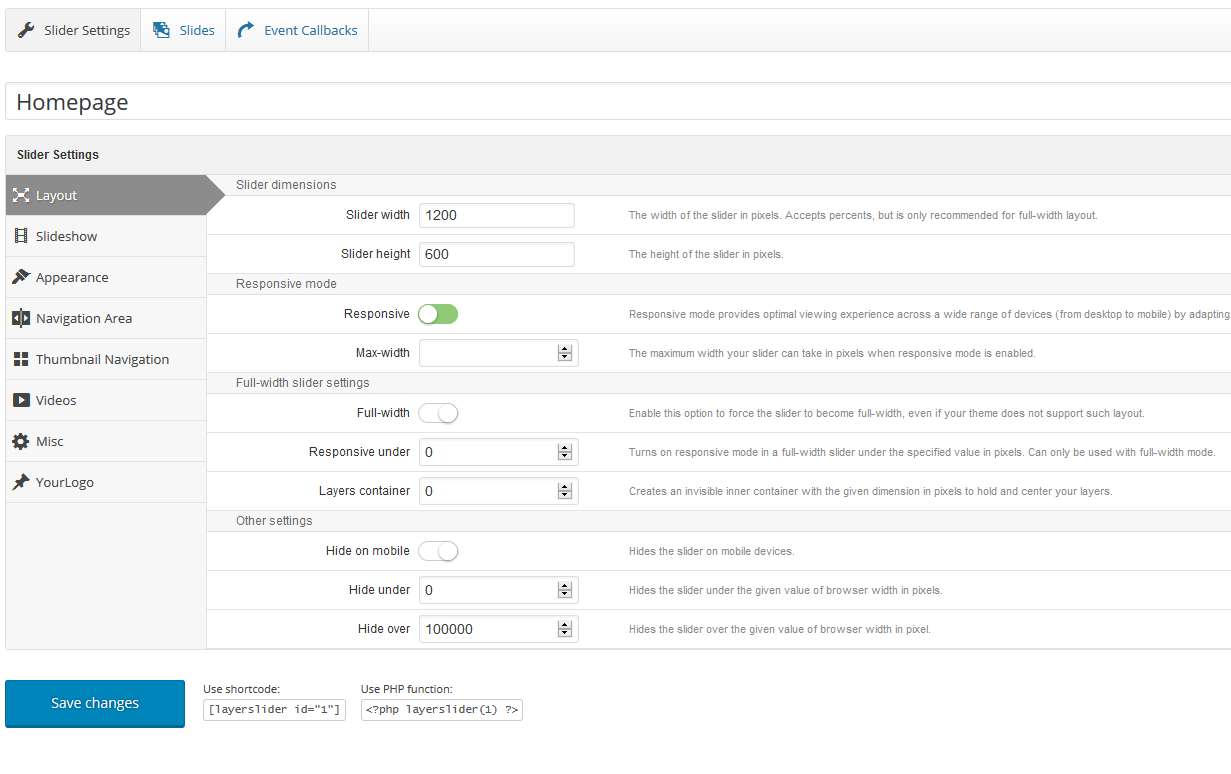
You’ll see the
/*Mobile Layout: 320px.and/*Tablet Layout: 768px.in style.css you should add to some rule for the slider for mobile view.For this; please go to your Theme Options panel and add those two rules in the custom css area:
/*		Tablet Layout: 768px.
--------------------------------------------------------------------------------------------------*/
@media only screen and (min-width: 768px) and (max-width: 991px) {

	.mainheaderwrapper {
		opacity: 1;
	}

	.yoursliderid {
		margin-top: 0;
	}

}

@media only screen and (max-width: 900px) {

	.mainheaderwrapper {
		opacity: 1;
	}

	.yoursliderid {
		margin-top: 0;
	}

}
I hope that will helps to you.
-
- AuthorPosts
- You must be logged in to reply to this topic.