Premium WordPress Themes, Templates & Plugins › Support › WordPress Theme Support › LastPoint › Transparant main header › Reply To: Transparant main header
April 14, 2016 at 7:09 am #8439
 ThemeofWP
Keymaster
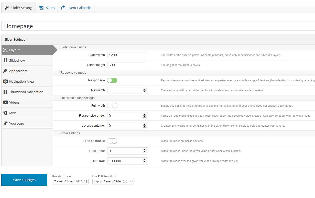
Hey Karim, here is the LastPoint WordPress theme demo slider settings:
You’ll see the
/*Mobile Layout: 320px. and /*Tablet Layout: 768px. in style.css you should add to some rule for the slider for mobile view.
For this; please go to your Theme Options panel and add those two rules in the custom css area:
/*		Tablet Layout: 768px.
--------------------------------------------------------------------------------------------------*/
@media only screen and (min-width: 768px) and (max-width: 991px) {

	.mainheaderwrapper {
		opacity: 1;
	}

	.yoursliderid {
		margin-top: 0;
	}

}

@media only screen and (max-width: 900px) {

	.mainheaderwrapper {
		opacity: 1;
	}

	.yoursliderid {
		margin-top: 0;
	}

}
I hope that will helps to you.